Rebranding is one of the most significant—and riskiest—moves a company can make. It’s a transformative process that can refresh a brand’s image, realign it with new values, and capture new markets. But as history has shown, rebranding is a double-edged sword. A poorly executed rebrand can alienate loyal customers, confuse audiences, and result in significant financial losses. On the other hand, a well-thought-out rebrand can propel a brand to new heights of success and cultural relevance.
This article explores the art and science of rebranding through case studies of successful and failed rebrands, including the controversial recent rebranding of Jaguar. By analyzing these examples, we’ll uncover actionable insights to guide brands toward rebranding success.
What Is Rebranding?
Rebranding involves a comprehensive overhaul of a company’s identity. It can include changes to:
- Logo and visual identity
- Brand messaging and tone
- Marketing strategies
- Product offerings
The goal? To reshape public perception and adapt to shifting market demands, cultural trends, or business strategies.
Brands rebrand for many reasons:
- Market Relevance: To stay competitive in a rapidly changing industry.
- Target New Audiences: To attract younger demographics or new markets.
- Crisis Recovery: To distance the brand from past controversies.
- Reflect Internal Changes: Mergers, acquisitions, or leadership changes often necessitate rebranding.
But as we’ll see, the stakes are high. A successful rebrand can elevate a brand, while a poorly executed one can sink it.
Jaguar’s Bold Rebrand
Overview :
In 2024, British luxury car manufacturer Jaguar unveiled a dramatic rebrand. As part of its transition to an all-electric lineup by 2026, Jaguar introduced a new logo, vibrant colors, and a marketing campaign emphasizing phrases like “Copy nothing” and “Live vivid.” However, the rebrand sparked significant backlash online, with critics accusing Jaguar of abandoning its heritage.
Key Moves :
- Visual Identity: Jaguar replaced its classic logo with a modernized version featuring mixed-case letters and a softer, golden “J” logo.
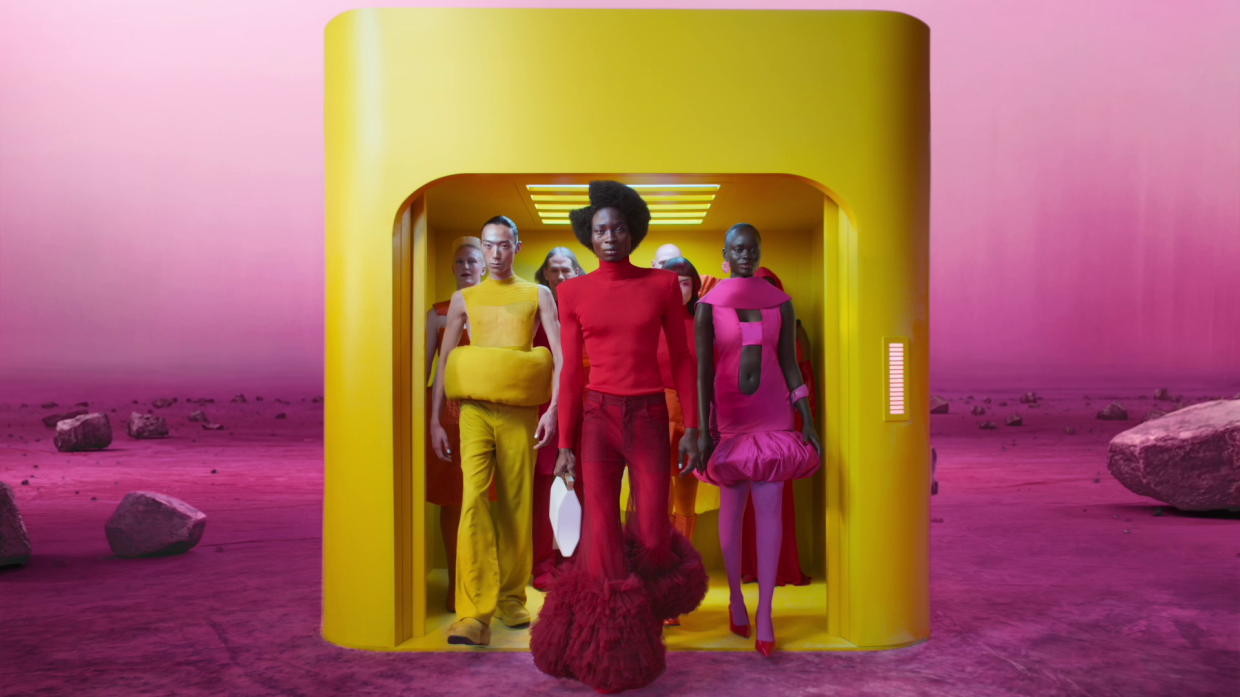
- Marketing Campaign: The campaign emphasized diversity and individuality, featuring avant-garde visuals but no actual vehicles.
- Color Palette: The brand swapped its traditional hues for bold, electric colors like pink and yellow.
Public Reaction
While Jaguar defended its rebrand as a necessary modernization, the response was polarizing. Loyalists criticized the lack of cars in the campaign and the departure from British tradition. Prominent figures like Elon Musk mocked the campaign, asking, “Do you sell cars?”
Lessons from Jaguar
- Balance Tradition and Innovation: While change is necessary, respecting a brand’s heritage can prevent alienating loyal customers.
- Highlight the Product: Even during a bold rebrand, the core product must remain the centerpiece of the messaging.
- Prepare for Backlash: Controversy is inevitable with significant change. Brands must be ready to defend their decisions and adapt if necessary.
Coca-Cola’s “New Coke” Disaster
Overview :
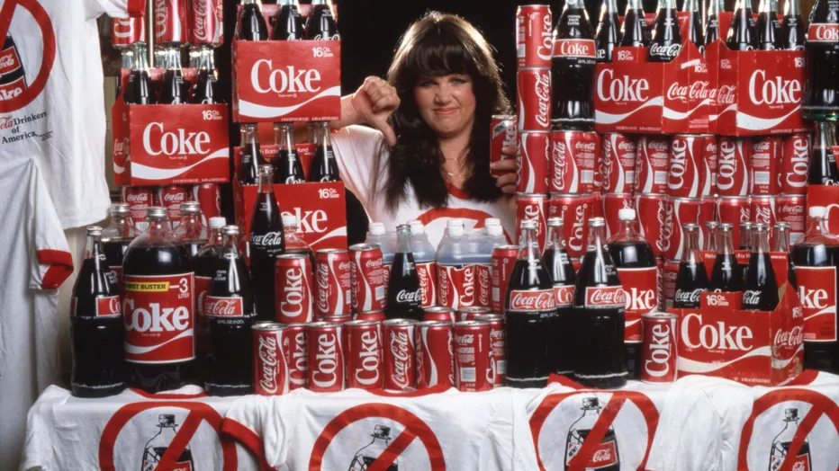
In 1985, Coca-Cola made the fateful decision to change its formula in response to competition from Pepsi. The new product, dubbed “New Coke,” was intended to modernize the brand’s image and appeal to younger audiences.
The Fallout
Customers revolted. The backlash was so severe that Coca-Cola reverted to its original formula within 79 days. The episode cost the company millions and served as a cautionary tale in branding.
What Went Wrong?
- Ignoring Customer Loyalty: Coca-Cola underestimated the emotional connection customers had with its original formula.
- Poor Communication: The rebrand wasn’t accompanied by a clear explanation, leading to confusion.
- Market Misjudgment: The company prioritized competition over understanding its core audience.
Key Takeaways
- Don’t Fix What Isn’t Broken: Rebranding should solve a clear problem, not create one.
- Test Before Launch: Thorough market testing can prevent costly mistakes.
- Acknowledge Mistakes Quickly: Coca-Cola’s prompt return to its original formula helped salvage its reputation.
The Gap Logo Fiasco
Overview
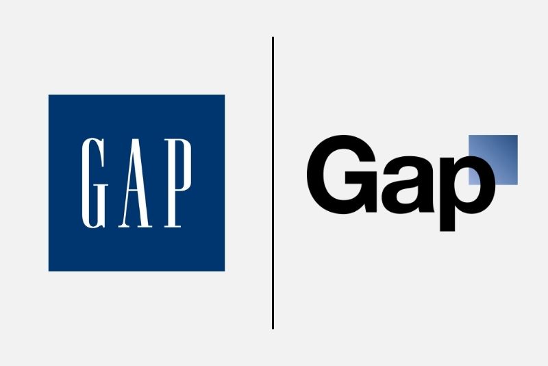
In 2010, Gap unveiled a new logo to modernize its image. The redesign was met with overwhelming criticism, with customers deriding it as bland and unoriginal.
The Aftermath
The backlash was swift and brutal. Within six days, Gap reverted to its classic logo, acknowledging its mistake.
What Went Wrong?
- Lack of Audience Engagement: Gap failed to consult its loyal customers before making a drastic change.
- Underwhelming Design: The new logo lacked the emotional resonance of the original.
- Poor Execution: The rollout felt rushed and unconsidered.
Key Takeaways
- Engage Your Audience: Loyal customers should feel included in major brand decisions.
- Test the Waters: Use focus groups and surveys to gauge public sentiment before launch.
- Don’t Rush the Process: Rebranding requires thoughtful planning and execution.
Old Spice’s Rebranding Success
Overview
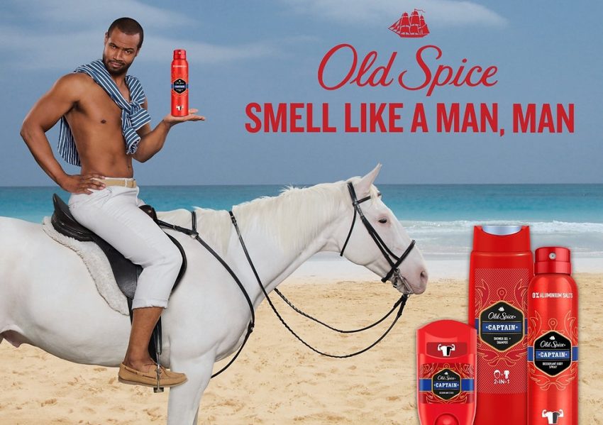
In the late 2000s, Old Spice was perceived as a dated brand for older men. In 2010, the company rebranded with a humorous and modern campaign targeting younger audiences. The “Smell Like a Man, Man” ads became a cultural phenomenon.
Key Moves
- Bold Marketing: The campaign used humor and over-the-top visuals to appeal to millennials.
- Modernized Messaging: Old Spice redefined masculinity, positioning itself as quirky and confident.
- Product Innovation: The rebrand was accompanied by new scents and product lines.
The Result
Sales skyrocketed, and Old Spice became a leader in the men’s grooming industry.
Key Takeaways
- Understand Your Audience: Old Spice’s rebrand succeeded because it addressed the needs and humor of younger consumers.
- Be Bold: Creative risk-taking can set a brand apart in competitive markets.
- Pair Marketing with Product: Successful rebranding involves aligning messaging with tangible product improvements.
Weight Watchers Becomes WW
Overview
In 2018, Weight Watchers rebranded as WW to emphasize wellness over weight loss. However, the move confused customers and led to a 34% drop in stock value.
What Went Wrong?
- Unclear Messaging: The new name lacked context, leaving customers unsure of the brand’s purpose.
- Alienating Core Customers: The rebrand downplayed the weight-loss focus that loyal customers valued.
- Poor Execution: The rollout didn’t effectively communicate the brand’s new mission.
Key Takeaways
- Communicate the Why: Customers need to understand the reason behind a rebrand.
- Stay True to Core Values: Shifting focus is fine, but abandoning what made the brand successful can backfire.
- Clarity Is Key: Rebranding should simplify, not complicate, the brand’s identity.
Apple’s Iconic Rebrand
Overview
In the late 1990s, Apple was struggling. Under Steve Jobs’ leadership, the company rebranded with the iconic “Think Different” campaign, emphasizing creativity and innovation.
Key Moves
- Unified Identity: Apple streamlined its product line and branding to focus on simplicity.
- Emotional Storytelling: The “Think Different” campaign resonated with audiences on a personal level.
- Innovative Products: The rebrand coincided with the launch of groundbreaking products like the iMac and iPod.
The Result
Apple’s rebrand transformed it into one of the most valuable companies in the world.
Key Takeaways
- Align Branding with Action: Apple’s rebrand worked because it was backed by innovative products.
- Tell a Story: Emotional narratives create lasting connections with customers.
- Focus on Simplicity: A clear and cohesive identity resonates across markets.
What Makes a Rebrand Successful?
Authenticity
Rebranding must reflect the company’s true values and goals. Customers can sense when a rebrand feels disingenuous.
Customer-Centric Approach
Engage loyal customers in the process to ensure the rebrand aligns with their expectations.
Clarity
Rebranding should simplify and strengthen a brand’s identity, not complicate it.
Testing
Test new designs, messaging, and strategies to identify potential pitfalls before launch.
Balance
Blend innovation with tradition to ensure continuity while embracing change.
Common Rebranding Pitfalls to Avoid
Neglecting Loyal Customers
Alienating your core audience can have devastating consequences, as seen with Tropicana and Weight Watchers.
Overlooking Brand Heritage
Brands like Jaguar and Gap learned the hard way that abandoning iconic elements can backfire.
Lack of Vision
Rebranding without a clear purpose leads to confusion, as evidenced by Meta’s rebrand from Facebook.
Focusing Only on Aesthetics
A rebrand isn’t just a visual update—it’s a strategic overhaul that should include messaging, products, and customer experience.
Rebranding is both an art and a science. It requires a deep understanding of a brand’s heritage, audience, and market trends. By studying successful and failed rebrands, we can identify key principles for success:
Stay true to your roots while embracing innovation.
Communicate changes clearly and authentically.
Involve your audience and listen to their feedback.
Whether you’re a legacy brand like Jaguar or an underdog like Old Spice, rebranding offers an opportunity to redefine your place in the market. The key is to approach the process with care, creativity, and a commitment to your customers. Done right, a rebrand isn’t just a facelift—it’s a renaissance.
